
How to Layer Art, Textures & Objects Like an Interior Designer

There's a difference between a room that's been decorated and a room that actually feels good to be in. You've probably walked into both. One feels like a showroom, everything coordinated, nothing out of place, and somehow completely cold. The other feels warm and interesting, like it has a history. That quality comes down to layering, and it's something anyone can learn.
Start With Your Art, Not Your Furniture
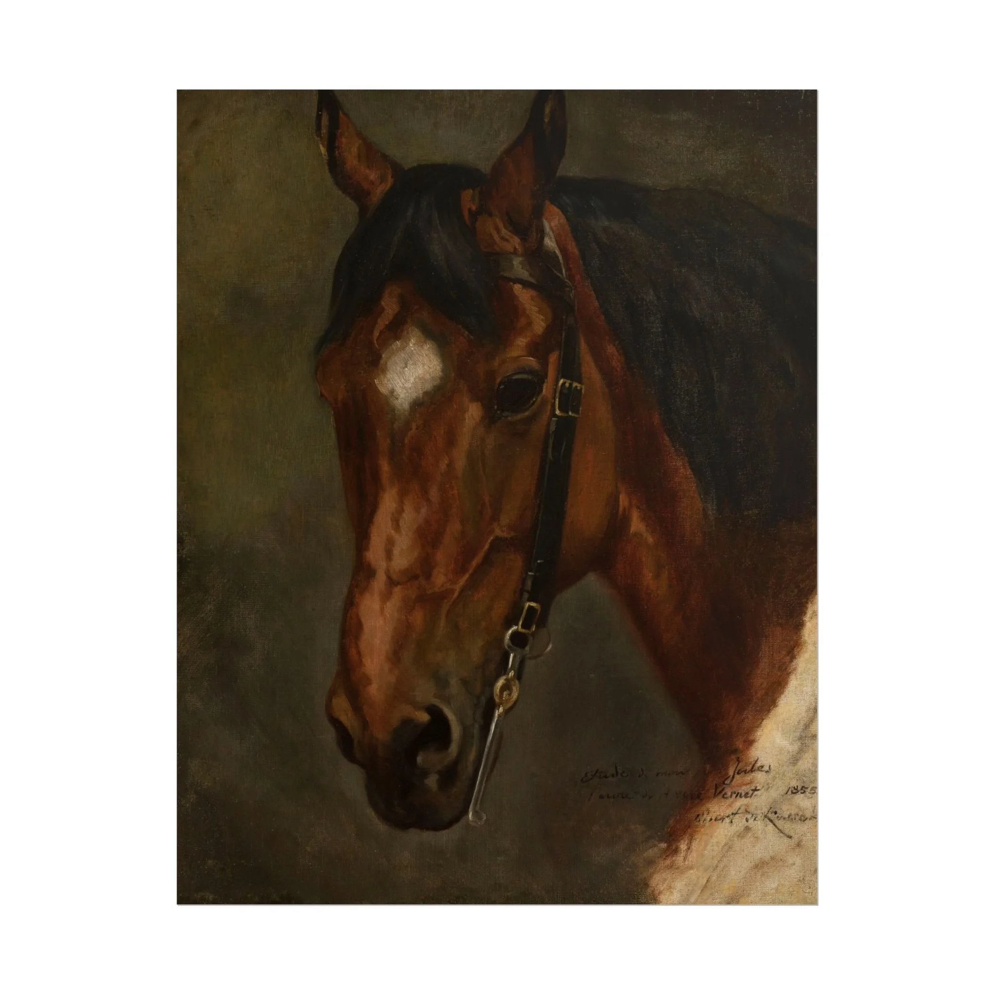
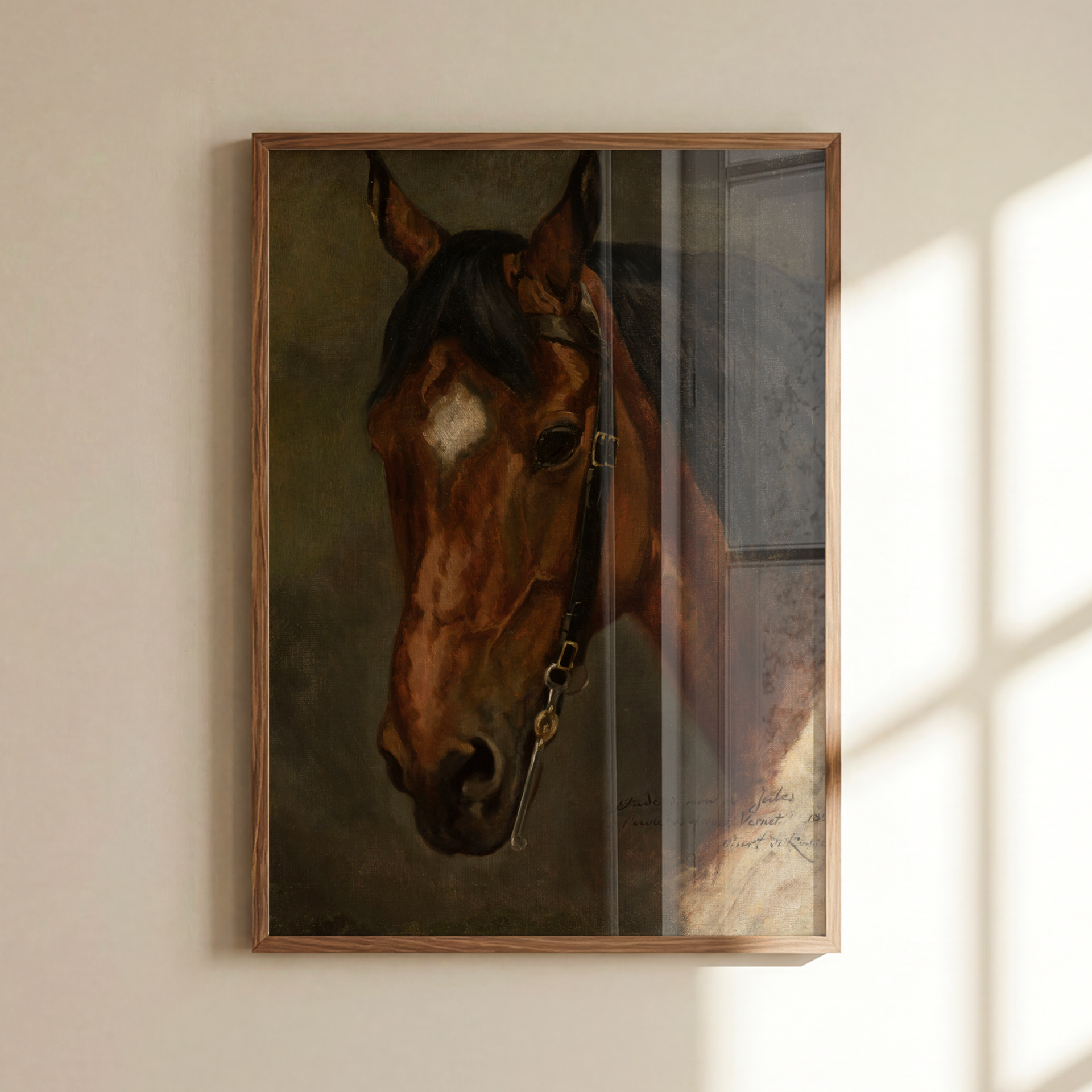
Most people hang their art last, treating it like a finishing touch once everything else is already in place. Interior designers tend to do the opposite. Art sets the mood, the colour story, and the feeling of a room before anything else does. It tells you what textures to bring in, what tones to echo, what the space is really about.
So before you buy another throw pillow or hunt for the perfect candle, find a piece of art you genuinely love. Let that be your starting point. Everything else will follow from it.
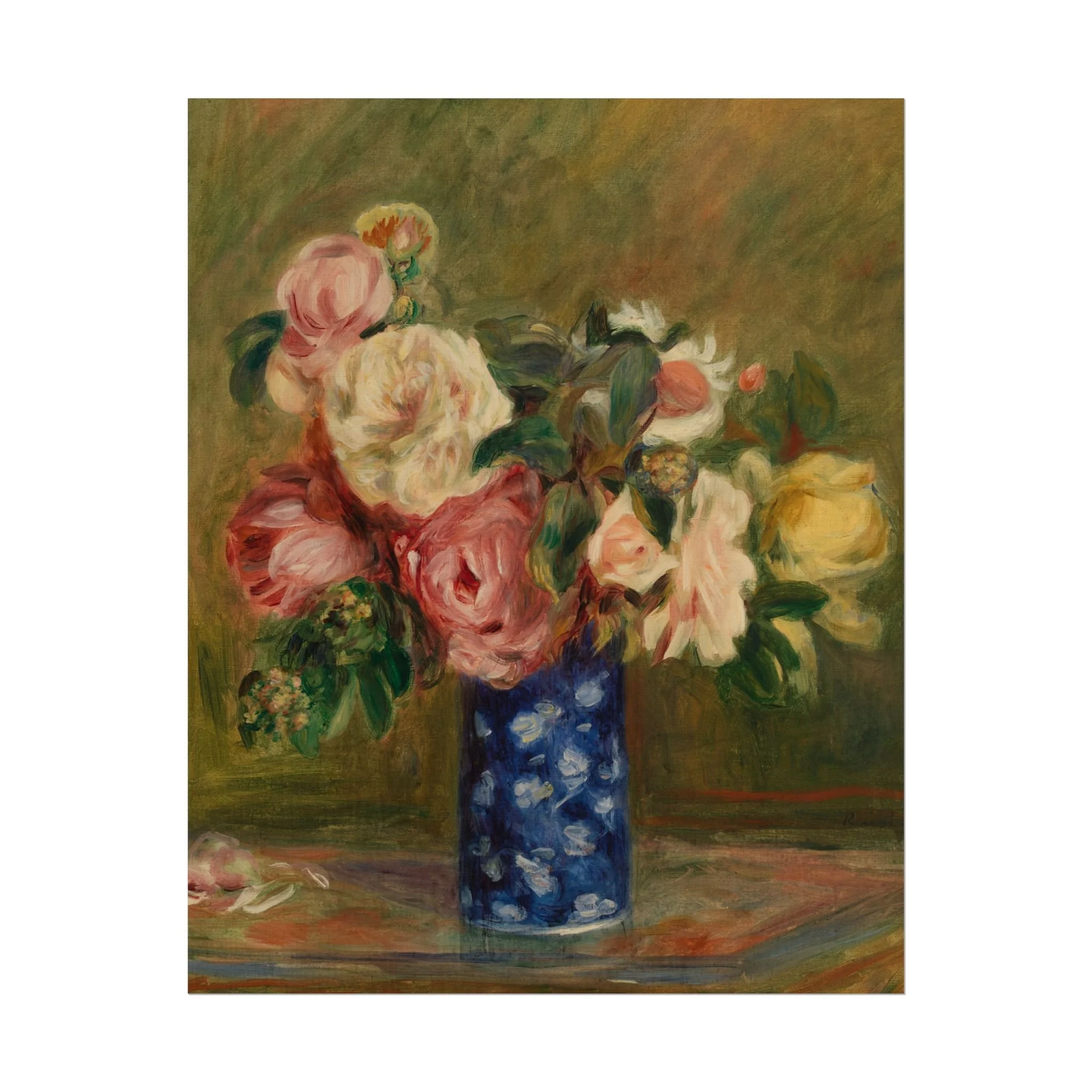
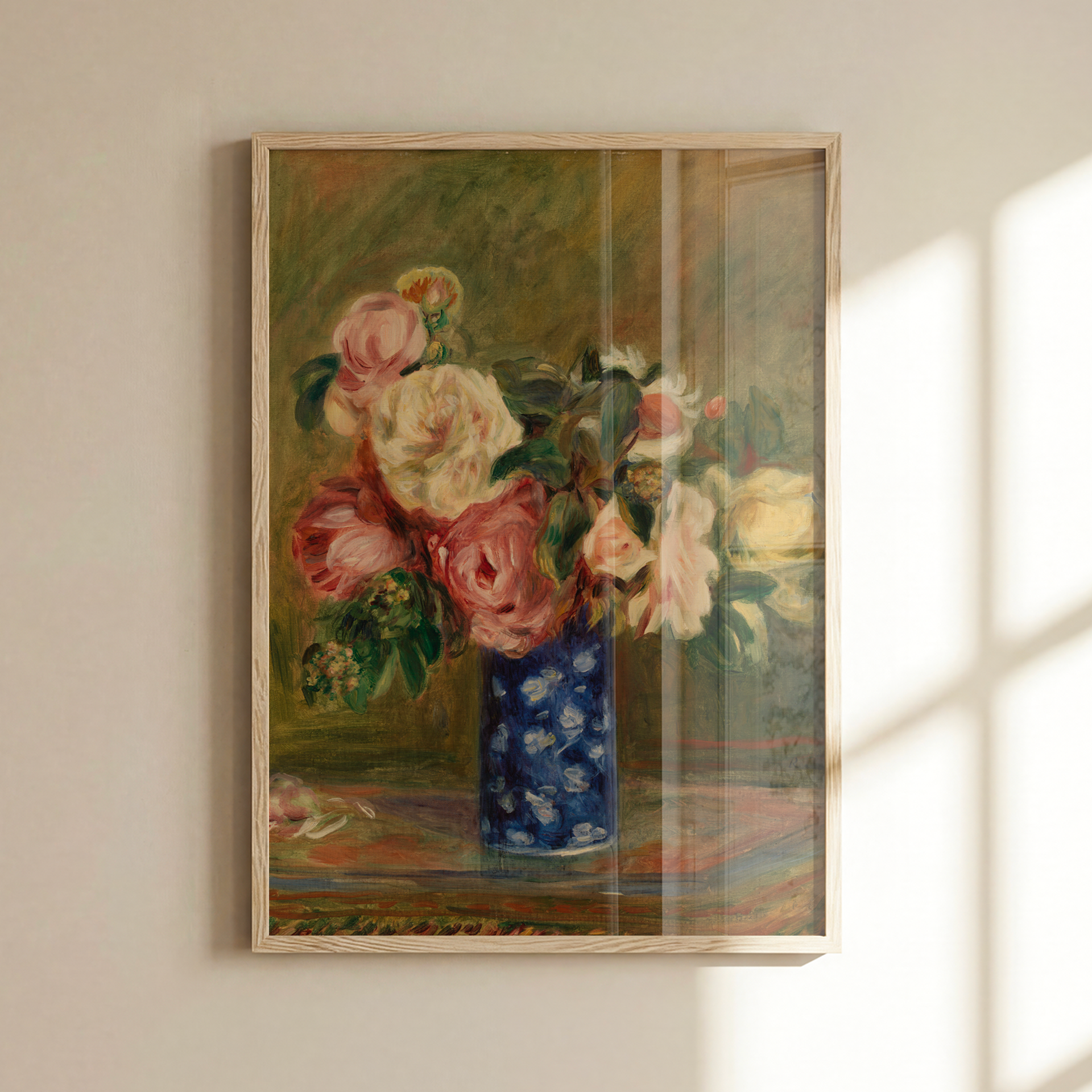
Elevate any room with a high-quality wall print. Available in a range of sizes to suit any space, it's an easy way to add personality and style to your home.
.: Two paper options - Semi-glossy and Matte
.: Multiple sizes to choose from: 8"x10", 11"x14", 16"x20", 18"x24"
* Print delivered rolled
Elevate any room with a high-quality wall print. Available in a range of sizes to suit any space, it's an easy way to add personality and style to your home.
.: Two paper options - Semi-glossy and Matte
.: Multiple sizes to choose from: 8"x10", 11"x14", 16"x20", 18"x24"
* Print delivered rolled
The Rule of Odd Numbers
When you're grouping objects on a shelf, a console, or a side table, odd numbers almost always look better than even ones. Three objects feel dynamic. Four of the same thing in a row feels like a shop display.
The reason odd groupings work is that they create a natural visual triangle, something for the eye to travel around rather than stop at. Try it with three candlesticks at different heights, or a little cluster of five things ranging from tall to low. It sounds simple because it is, but it makes a real difference.
Mixing Textures
A room full of smooth, hard surfaces feels clinical. A room with only soft things feels undefined. The interest comes from contrast.
Think about what happens when a rough ceramic vase sits on a polished wood surface, or a linen throw gets draped over a wooden chair, or a velvet cushion ends up next to something with a bit of sheen. None of those combinations are complicated, but together they give a room tactile variety that makes people want to spend time in it.
Three or four distinct materials in a space is usually all you need. More than that and it starts to feel busy.
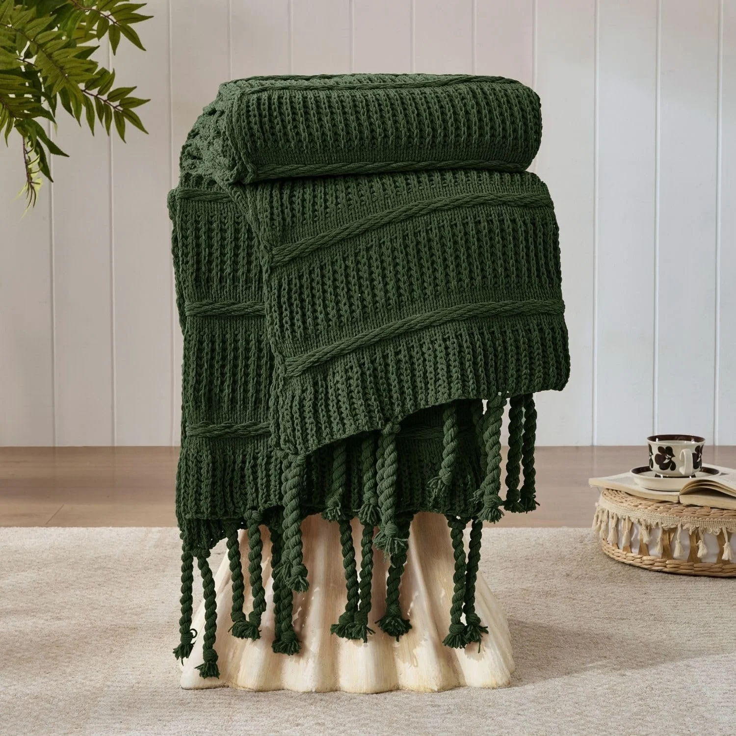
Boho Knitted Chenille Blanket - Amazon
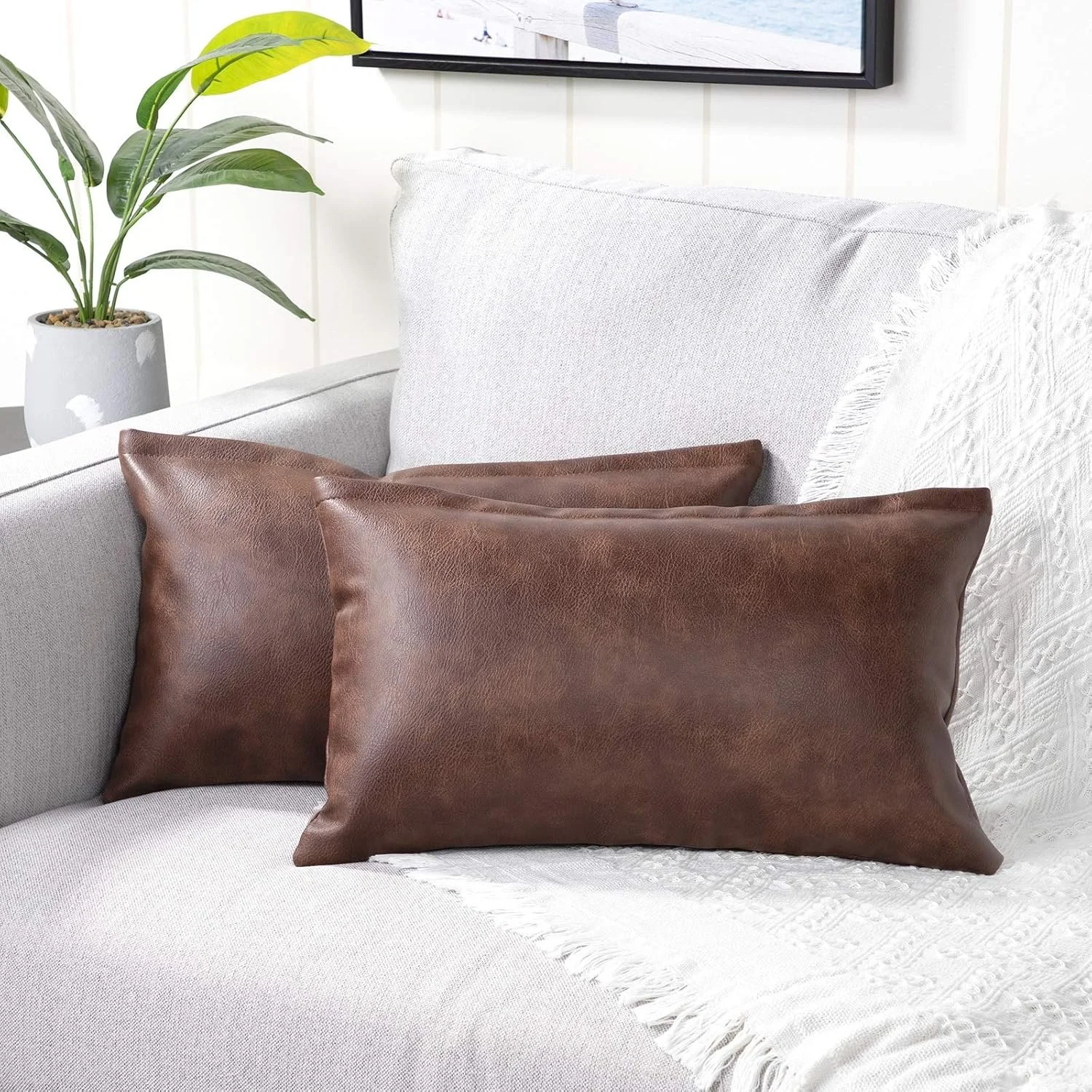
Lumbar Faux Leather Throw Pillow Covers - Amazon
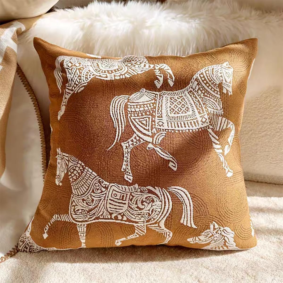
Croker Horse Throw Pillow Cushion Cover - Amazon
Height and Scale Matter More Than You Think
When everything on a surface sits at the same height, the whole thing reads as flat. Designers think in terms of levels: tall, medium, and low, and they make sure each arrangement has some of all three.
On a bookshelf that might look like a tall vase at one end, a horizontal stack of books in the middle, and a small object sitting in front. On a console table it could be a framed print leaning against the wall, a lamp at medium height, and a low bowl in front of that. The variation creates a kind of rhythm that's hard to articulate but easy to feel when you walk into a room.
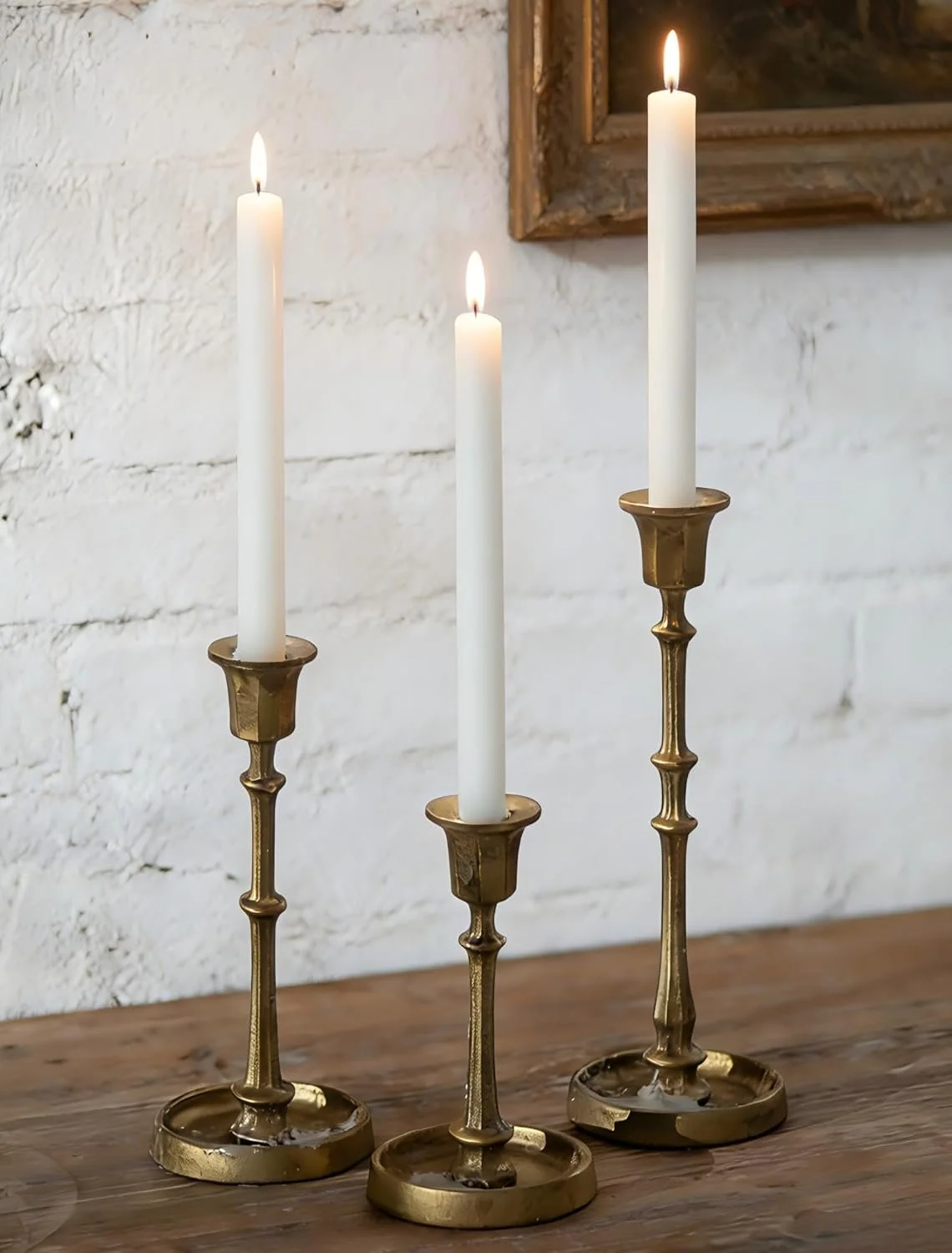
Cast Iron Candlestick Holders - Amazon

Rattan Table Lamp - Amazon
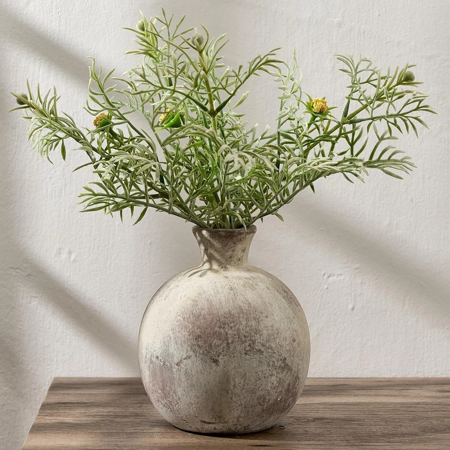
Rustic Ceramic Vase - Amazon
Pulling Colour Rather Than Matching It
A lot of people try to match everything and end up with a room that looks like a catalogue page. The curtain matches the cushion matches the rug and somehow it all feels less than the sum of its parts.
What works better is pulling colour rather than copying it. If your vintage floral print has dusty rose, forest green, and warm cream in it, you don't need a rose cushion. You might bring in a deep green throw and let the cream come through in the walls or a piece of furniture. The art ties it together without everything being identical.
This is one of the biggest reasons to start with art. It hands you a palette to work from rather than leaving you guessing.

Vintage Floral Chinoiserie Ceramic Vase - Amazon
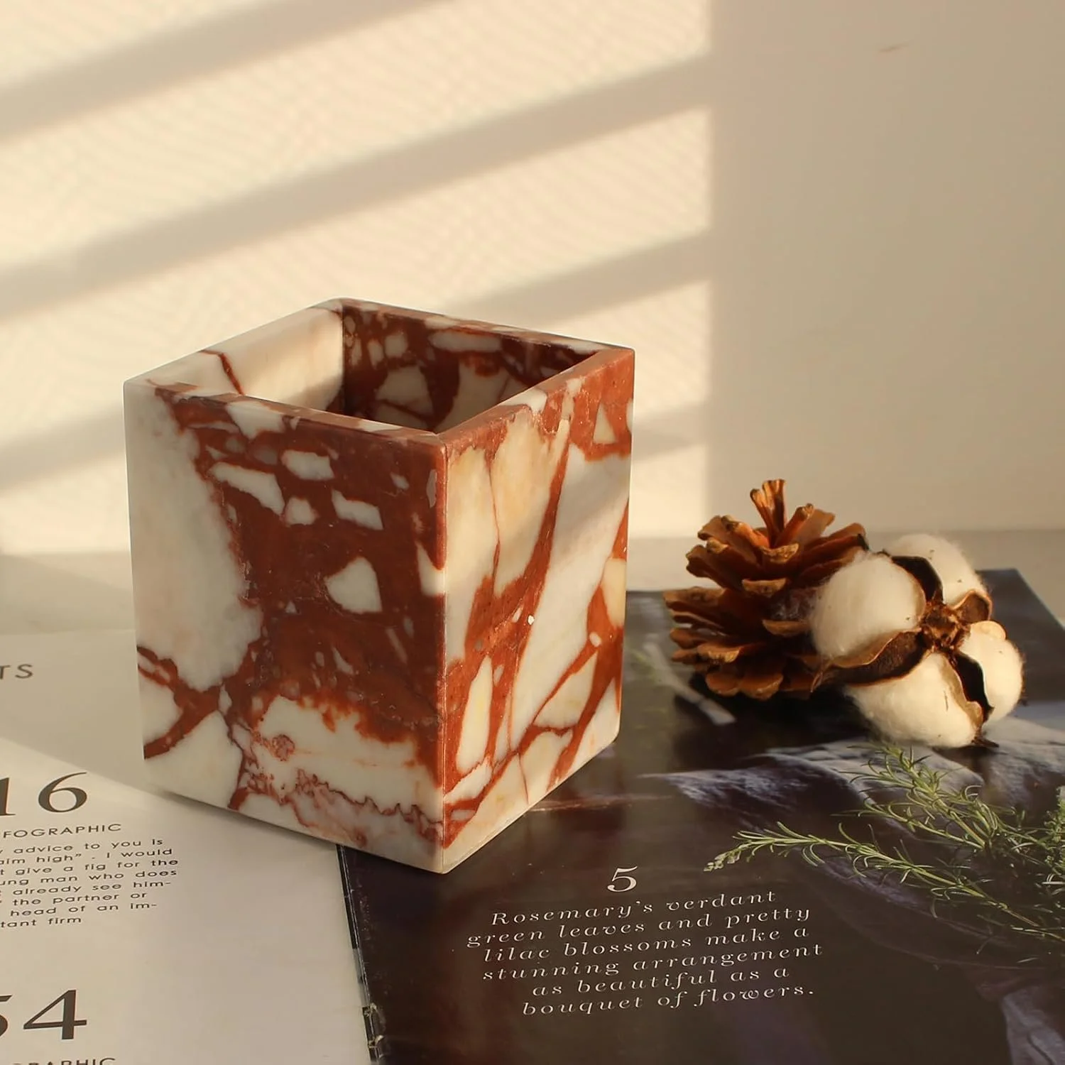
Natural Marble Holder - Amazon
Making It Look Collected, Not Decorated
The rooms that feel most beautiful tend to look like they came together over years rather than one weekend. A print picked up at a market, a vase from a holiday, a book that's been on every shelf you've ever owned. That sense of accumulation is hard to fake but easy to approximate.
Mixing eras and origins helps. A modern ceramic next to a vintage print, an old book beside something more contemporary. Imperfection is part of it too. Things don't need to be pristine. A bit of wear and patina signals that a space is actually lived in, which is the whole point.

Natural Marble Tray - Amazon

Handwoven Large Wicker Storage Baskets - Amazon
The Mistake Most People Make
Overcrowding. Layering is not the same as filling every surface. Negative space is just as important as the objects you choose to display. It gives the eye somewhere to land and makes what you do put out feel considered rather than crammed in.
If something isn't pulling its weight, take it out. Editing is half the work.
None of this has to happen all at once. Pick one corner, one shelf, one wall and start there. Move things around until it feels right. Add something, take something away. The best interiors are always a little bit of a work in progress, and that's what makes them interesting.